The Wine People came to us with a clear mission: create a brand that feels lived-in, fun, and unapologetic — the antithesis of wine-world pretension. They weren’t interested in polished perfection or safe design choices. Instead, they wanted something that looked like it had already been to a few parties, spilled a little, and had the best stories to tell.
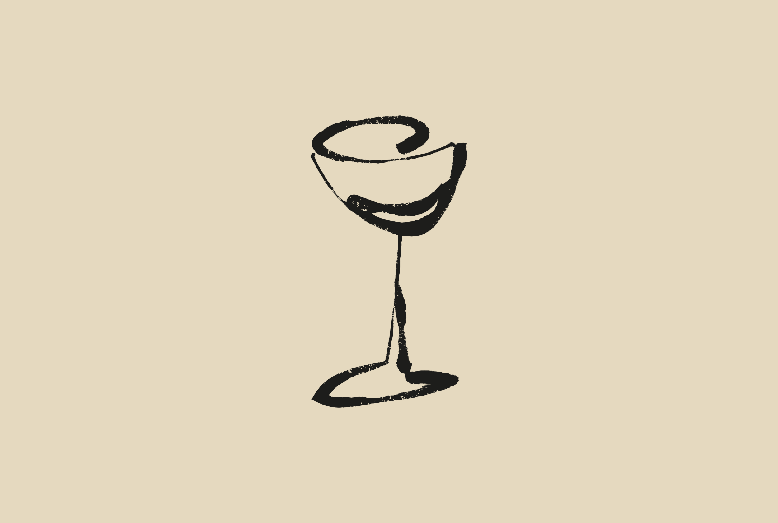
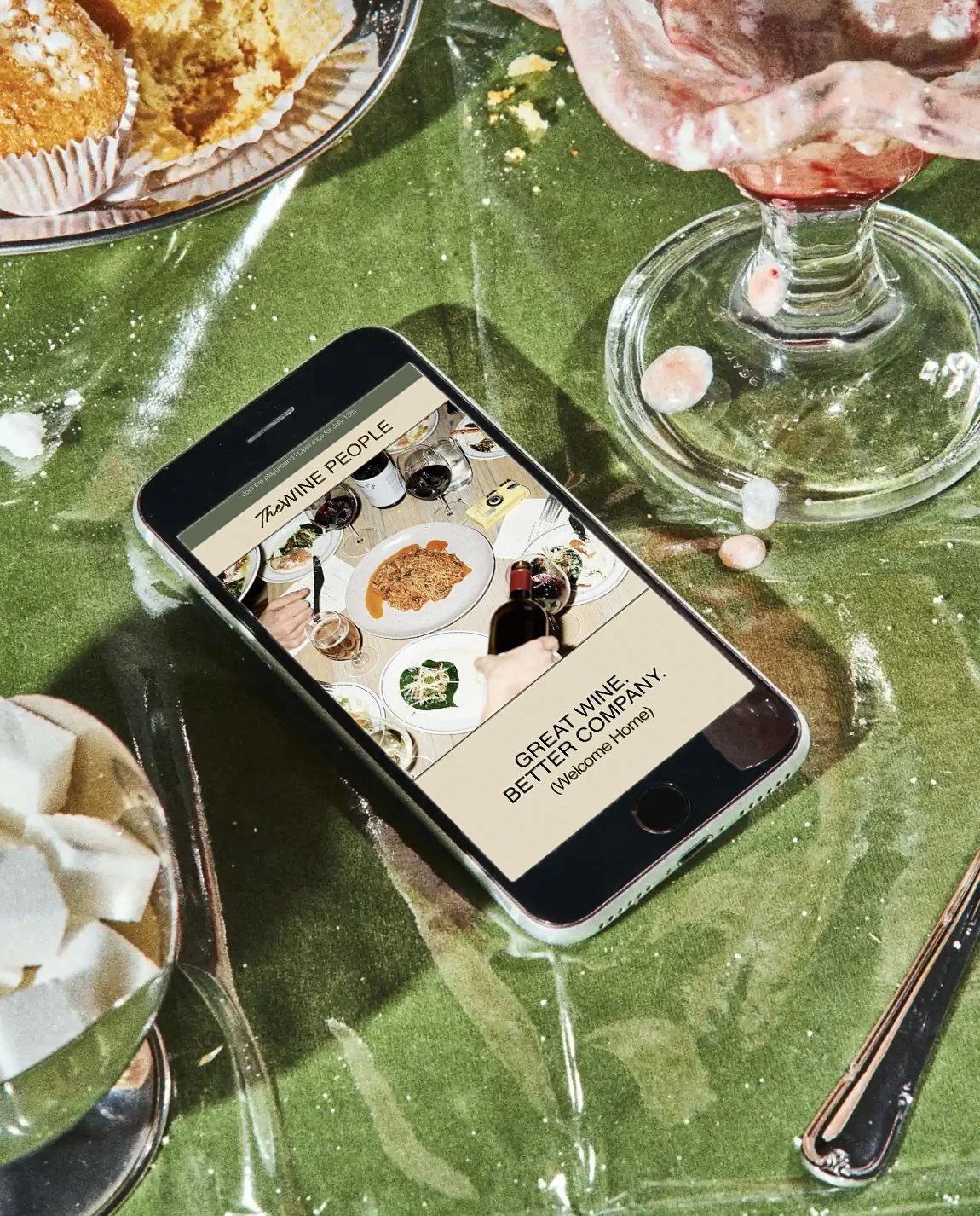
From the start, we knew this brand had to move. It had to feel like people in conversation, wine being poured, voices overlapping, and laughter spilling out of the room. We built an identity system that pairs bold, structured typography with scribbles, sketches, and perfectly imperfect details. A design language that balances clean and messy, elegant and human.
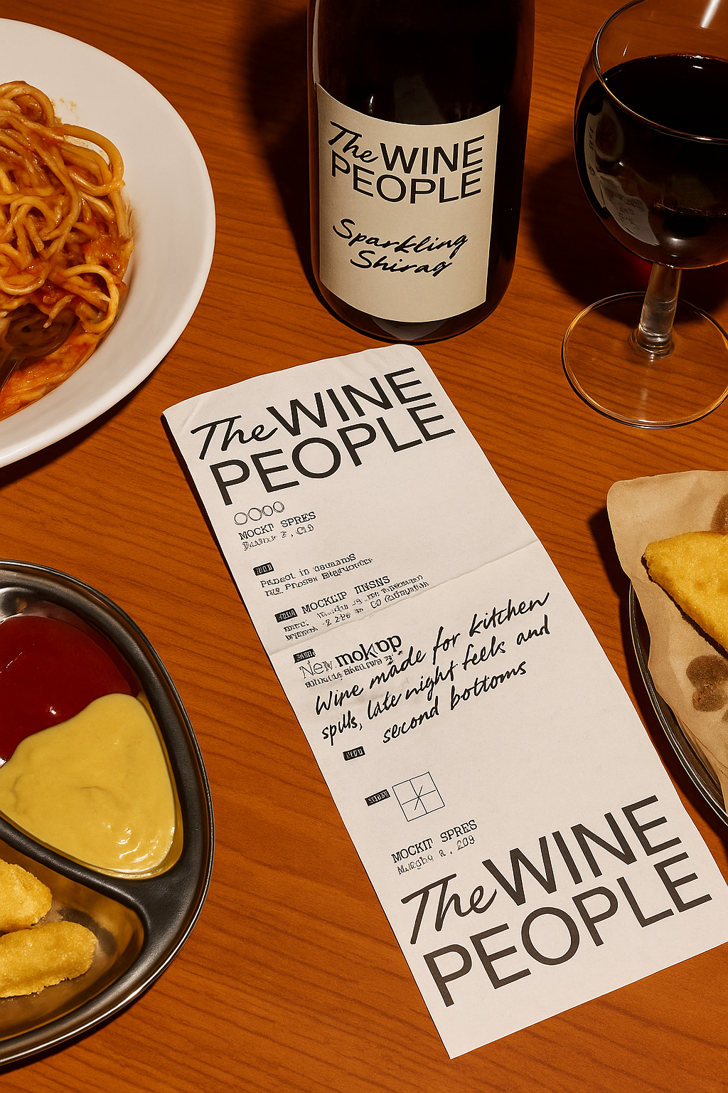
The packaging became an extension of the brand’s personality — tactile, expressive, and a little rebellious. Each label feels like part of a bigger story, while still having its own moment in the spotlight. Combined with photography that’s candid, high-contrast, and full of life, the brand unapologetically leans into the chaos that makes wine drinking so good.
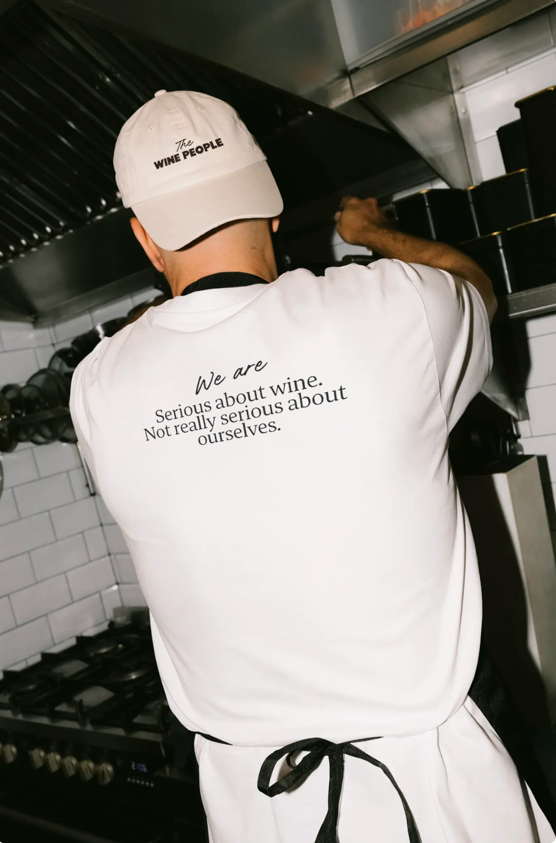
The result? A brand that throws out the rules, toasts to the weirdos, and puts people back at the centre of the wine experience. Serious about wine, not so serious about ourselves.